· 2 min read
Designing status lights that don't lie
A green dot is a promise — the system verified something. Most products break it. Notes from aircraft interfaces to web UIs.
Reactions
In aviation interfaces, a status light is a contract. Green means the system verified something and is prepared to be trusted with the next action. If the light lies once, the operator spends every future second checking manually — and the instrument has become decoration.
Web products have the same contract, and break it constantly.
The three honest states
Every live indicator I ship is bound to one rule: green only when a human would sign for it.
/* the pulse is not the status; it's the heartbeat proving the status is alive */
.pulse-dot::after {
  box-shadow: 0 0 0 0 rgb(62 124 79 / 0.45);
  animation: pulse-ring 2.4s ease-out infinite;
}
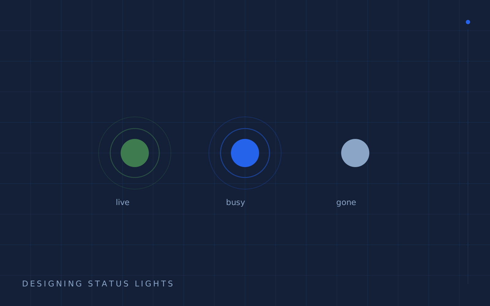
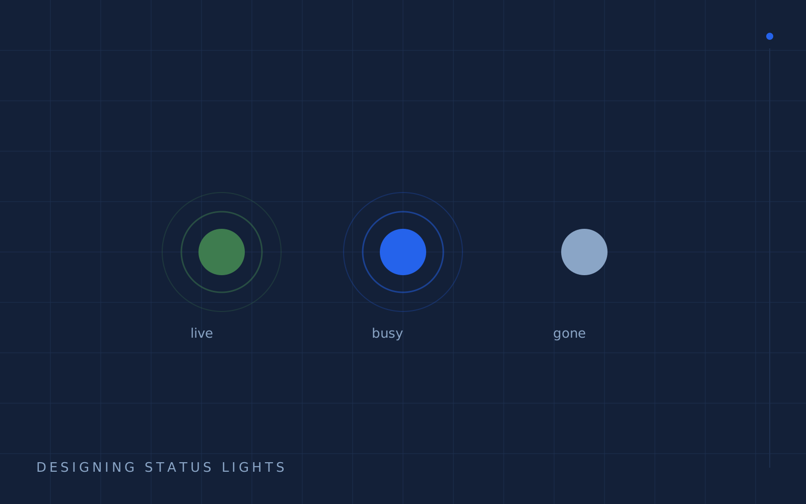
Three states, three visual vocabularies:
- Live — bright, animated, verifiable. ServiceMenu is deployed at a URL I can open right now; it gets the dot.
- Building — muted mono text, no color ambition. CollectKit gets "building" because a demo is not a deployment.
- Absent — no signal at all. An empty state is honest information; a greyed-out "coming soon" is a debt.
Where autonomy habits improved the web work
- Statuses are claims. I treat a badge on a project page like a telemetry bit in a cockpit — it has to trace to a verifiable source or it doesn't render.
- Response timing is information. Progress indicators communicate where you are in a task, the way an attitude indicator tells a pilot which way is up. Same job, different vehicle.
- Calm colors carry weight. If everything pulses, nothing means urgent. Green belongs to facts, not to vibes.
The test before you ship a dot
Ask: if this indicator is wrong, does anyone find out the hard way? If yes — it gets a source, a color, and probably a pulse. If nobody does, delete it. Every fake light you remove makes all your real ones brighter.
Tools covered